Target RedCard
Senior UX Design
Credit/DebitApplication Redesign
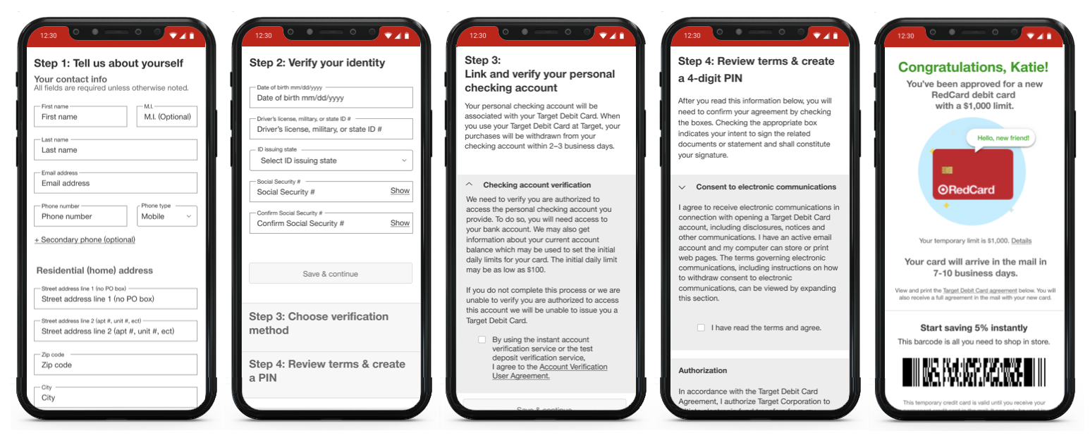
I had the task of updating the current Credit & Debit Application process, previously not adaptive and consisted of over 20 steps to complete, we saw a large abandonment rate with the cumbersome process. The newly designed, adaptive and 3 step process saw a huge lift in completion as soon as it was launched. In addition the debt application integrated an instant verification feature allowing the guests to sign into their online financial institution and be approved instantly instead of waiting for the manual option where it could take a week or more to verify and approve. Multiple rounds of guest testing got us to the final result that was the most intuitive and easy to maneuver for out guest.


Results
The redesign increased application completion by 40% with an overall higher approval rating of 27%.
80% of debit application verification is happening using Instant Account Verification. This is a cost savings for Target and is faster and easier for the Guest.
Digital is now the preferred source for RedCard enrollment up by 50% from before the redesign, this is taking stress off the team members in store and reducing wait times for applications being submitted while standing in line.

